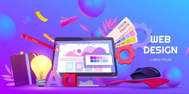
Web design is constantly evolving, and one trend that’s become hard to ignore is the rise of vibrant colors. What was once a bold choice for specific brands is now a standard feature across many websites, creating a fresh and engaging user experience. Far from just being eye-catching, vibrant colors are playing a key role in how websites connect with users, enhance brand identity, and drive interactions. In this article, we’ll explore why bold color schemes are making such a big impact, how they shape user behavior, and why incorporating them into your design might be the right move.
The Power of Color in Web Design
Color is one of the most powerful tools in web design. It influences emotions, helps establish brand identity, and even directs user behavior. Vibrant colors, in particular, can make a website feel alive and engaging. But why exactly do vibrant colors work so well?
The Role of Color in First Impressions
Research shows that users form opinions about a website in a matter of seconds. A site’s design—especially its color scheme—can determine whether users stick around or leave. Bold, vibrant colors create a striking first impression, making visitors more likely to engage with the site’s content.
Vibrant colors, when used thoughtfully, can help build trust, grab attention, and differentiate a brand from its competitors.
Why Vibrant Colors Are So Effective
Vibrant colors go beyond just aesthetics. Here are several reasons why they are such a powerful tool in web design:
1. Attention-Grabbing
The primary reason vibrant colors are so effective is their ability to grab attention. With the internet being a crowded space, standing out is critical. Bright, bold colors naturally draw the eye, making key website elements more noticeable.
Key Takeaway:
- Use vibrant colors for CTAs (Call to Actions): Bold colors help CTAs like "Buy Now" or "Sign Up" stand out, encouraging users to take action.
2. Creating Mood and Emotion
Color psychology plays a major role in how people interact with websites. Different colors evoke different emotions, and vibrant colors can amplify those feelings. For example:
- Red symbolizes urgency, excitement, and passion.
- Yellow is associated with optimism, energy, and positivity.
- Blue conveys trust, calmness, and professionalism.
- Green suggests health, growth, and stability.
By strategically incorporating these colors, designers can create a specific atmosphere and influence how visitors feel when they interact with a site.
3. Enhancing User Experience
Vibrant colors can help improve user experience by making key elements stand out. For instance, bright buttons, links, and icons are easier to spot, allowing users to navigate the site more intuitively. This can lead to longer time spent on the site and higher engagement rates.
- Vibrant colors in navigation and interactive elements help users quickly identify what’s clickable or interactive, improving the overall experience.
4. Differentiating Brands
In an increasingly competitive digital landscape, brands need every edge they can get. Vibrant colors can be used to create a unique visual identity, making a website stand out and leaving a lasting impression.
Best Practices for Using Vibrant Colors in Web Design
While vibrant colors are effective, they need to be used strategically to avoid overwhelming users. Here are some best practices for incorporating vibrant colors into your web design:
1. Balance with Neutral Tones
Although bright colors are eye-catching, using too many can create visual clutter. It’s important to balance vibrant hues with neutral tones like whites, grays, and blacks to give the design a clean, polished look. This helps the bold colors pop without overwhelming the user.
Example:
- Use vibrant colors for calls to action, buttons, or links, but keep the background neutral to ensure the content remains easy to read.
2. Stay Consistent with Your Branding
When choosing vibrant colors, make sure they align with your brand’s personality. Your website’s color palette should reflect the essence of your brand and remain consistent across all touchpoints. Consistent use of color helps build trust and reinforces brand identity.
3. Ensure Accessibility
While vibrant colors can be striking, it’s important to maintain good contrast to ensure readability. Poor contrast can make text hard to read and can exclude users with visual impairments. Tools like the Web Content Accessibility Guidelines (WCAG) can help ensure your website meets accessibility standards.
- For example, bright text on a bright background can be hard to read. Use high contrast between text and background for better readability.
4. Test and Iterate
Before finalizing your color scheme, test different combinations and gather user feedback. A/B testing can help you determine which color schemes resonate most with your audience, leading to higher engagement and conversion rates.
Gabriel Schmidt – Web Design & Digital Strategy emphasizes the importance of testing and refining design elements. By experimenting with different vibrant color combinations, you can learn what works best for your target audience and make informed adjustments based on the results.
Vibrant Colors in Different Industries
Vibrant colors are not just for tech or music brands. They are being embraced across various industries, where they help enhance user experience, establish brand identity, and drive conversions. Let’s explore how different sectors are using vibrant colors in their web design.
1. E-Commerce
In e-commerce, vibrant colors are often used to highlight promotions, products, and CTAs. Websites use bold colors to guide users toward important actions, such as making a purchase or signing up for newsletters.
2. Healthcare
Healthcare websites are increasingly using vibrant colors to make their designs more welcoming while conveying trust and reliability. Bright blues, greens, and oranges are often used to create a warm, inviting atmosphere without sacrificing professionalism.
- Brands in wellness or fitness use vibrant colors to encourage a sense of well-being, creating an approachable and calming environment for users.
3. Travel and Hospitality
Travel websites use vibrant colors to inspire excitement and convey a sense of adventure. Websites use warm and inviting color palettes to entice users to explore new destinations and book travel experiences.
4. Food and Beverage
Food and beverage websites use bright, vibrant colors to make their products look fresh and appealing. Bright colors stimulate appetite and engage users, encouraging them to explore menus or make purchases.
The Future of Vibrant Colors in Web Design
As technology continues to advance, we can expect vibrant colors to play an even more significant role in web design. New tools and design capabilities are making it easier to experiment with dynamic, interactive color schemes, giving designers more freedom to create engaging, memorable websites.
1. Dynamic and Interactive Colors
With the rise of CSS and JavaScript, we’re starting to see more websites incorporate dynamic, interactive colors that change based on user actions. Hover effects, animated backgrounds, and color transitions are all becoming more common, offering users a more engaging experience.
2. AI-Generated Color Schemes
In the future, AI may help designers choose color palettes based on user preferences and behavior. AI-powered tools could analyze user data to recommend color schemes that are most likely to engage visitors, making color selection more data-driven.
Conclusion
Vibrant colors are no longer just a design trend—they’ve become an essential part of web design, helping to enhance user experience, build stronger brands, and drive user engagement. When used strategically, bold colors can make a website more memorable and effective. Whether you're creating a new site or refreshing an existing one, incorporating vibrant colors in the right way can help you stand out from the crowd and connect with your audience on a deeper level.


