

The Confidence Advantage: Why Embossed Business Cards Still Matter (and How They Upgrade First Impressions)
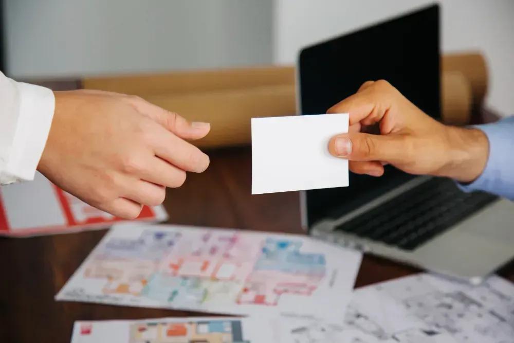
Image source: freepik
We live in a world where nearly everything is digital—introductions, follow-ups, portfolios, even entire businesses. And yet, the moments that shape opportunities are still deeply human: a quick conversation, a handshake, a referral, a chance meeting that turns into a call you didn’t expect. In those moments, people aren’t only processing what you say. They’re picking up on signals—whether you seem prepared, credible, and intentional.
That’s why physical touchpoints still matter. Not because they’re “old school,” but because they create something digital can’t: a real-world experience that sticks. A business card is one of the smallest pieces of marketing you can carry, but it often shows up at the exact moment it counts. When the card feels cheap or forgettable, it quietly lowers your perceived value. When it feels premium—thick, cleanly designed, and finished with a tactile detail like embossing—it creates a different emotion entirely: confidence. Not the loud kind. The calm kind. The kind people trust.
Why Business Cards Still Work in 2026
If you’ve ever tried to exchange contact info mid-conversation, you know the friction: phones come out, someone’s typing, names get misspelled, notifications pull attention away, and “I’ll follow you later” becomes “I forgot.” Business cards solve that problem instantly. They’re fast, frictionless, and surprisingly memorable—especially when they’re done right.
But the bigger reason business cards still work is psychological. In-person interactions move fast, and people make quick judgments. A strong business card communicates several things without saying a word:
You’re prepared. You expected to meet people and you’re ready to follow through.
You value details. Small choices suggest the big choices matter too.
You take your work seriously. Your presentation matches your promise.
This is especially true for founders, freelancers, consultants, creators, sales pros, and anyone building a reputation through relationships. Your card isn’t just a contact slip—it’s a micro-version of your brand. The goal isn’t to impress everyone. The goal is to be remembered by the right people.
Premium Isn’t About Flash—It’s About Feel
Most people assume “premium” means fancy graphics, heavy patterns, or complicated designs. In reality, premium usually looks simpler: clean typography, strong spacing, and one or two intentional details. It’s the same reason a well-designed room feels expensive even if it isn’t full of expensive objects—the choices are deliberate.
A premium business card works the same way. It feels like someone cared. And that feeling transfers to the person holding it. Two elements create that premium effect faster than almost anything else:
Substantial stock (a thicker, higher-quality paper that doesn’t bend like a flimsy flyer)
Tactile finishing (a physical detail you can feel, not just see)
That’s where embossing becomes a quiet power move.
What Embossing Is (and Why It Makes People Pause)
Embossing is a finishing technique that creates a raised impression on the surface of your card. A precision metal die presses part of the design upward—often a logo, icon, monogram, or brand mark—so it becomes tactile. It’s one of the few print upgrades that people notice instantly without needing to “understand” design. They don’t have to know what embossing is called to feel the difference.
The reason embossing works is simple: it changes behavior. Most cards are skimmed visually and stuffed into a pocket. Embossed cards trigger a different response. People touch them. They run a thumb across the raised mark. That split-second pause increases attention, and attention increases memory. In a world of flat screens and quick scrolling, texture stands out.
Embossing also communicates something subtle but powerful: restraint. It’s often used by brands that don’t need to shout. The elevated look says, “We’re confident in what we do.” That’s a strong signal whether you’re building a business, leveling up a career, or simply tightening your personal brand.
Blind Emboss vs. Registered Emboss: Two Styles, Two Vibes
If you’re considering embossing, it helps to know the two most common approaches:
Blind Emboss
A blind emboss is texture only—no ink or foil applied to the raised area. It’s clean, modern, and extremely refined. This is the go-to choice for brands that want a “quiet luxury” look: minimal but unmistakably premium. It pairs especially well with thick stock and simple typography.
Registered Emboss
Registered embossing aligns the raised area with printed elements. It can feel bolder and more graphic, which works well for brands that want stronger visual impact while still adding a tactile element. When done right, it feels precise and intentional—not busy.
If you’re unsure which is best, here’s a quick rule:
Blind emboss = understated, modern, elegant
Registered emboss = bold, graphic, higher contrast
The Biggest Mistake People Make: Over-Designing
Embossing is most effective when it supports one strong element. Many people try to emboss too much—tiny details, thin lines, small text, or half the card. That’s how you end up with a design that feels complicated instead of premium.
The strongest embossed cards usually keep it simple:
a single logo or brand mark
a clean monogram
a minimal icon
a short phrase used as a brand signature (not micro text)
Think of embossing like a signature accessory. It should enhance the look, not compete with it. A clean layout with one intentional tactile element often looks more expensive than a card packed with features.
Upgrades That Pair Well (Without Going Overboard)
Embossing alone can be enough. But if your brand positioning is premium and you want extra impact, a few combinations tend to work consistently:
Foil + emboss: metallic shine plus raised depth (a classic luxury combo).
Spot UV / raised Spot UV: targeted gloss and optional texture for contrast on matte stocks.
Painted or foil edges: a finishing touch that makes thick cards feel even more high-end.
The key is restraint. Premium isn’t stacking every finish. Premium is choosing one hero detail and letting it breathe.
Why This Matters for Confidence (Not Just Marketing)
Here’s the part most people miss: premium business cards don’t just change how others see you—they change how you show up. When you hand someone a card you’re proud of, you feel more grounded in your identity. You speak more clearly about what you do. You’re more likely to follow up. You stop shrinking. Those small shifts compound over time.
This is especially true for new entrepreneurs, people switching careers, and anyone rebuilding momentum. A premium card becomes a tangible reminder that you’re taking yourself seriously. It’s not about pretending to be bigger than you are. It’s about matching your presentation to your ambition.
A Simple Checklist for a Card That Feels Premium
Keep the design clean. White space makes everything look more intentional.
Use readable typography. Elegant doesn’t mean hard to read.
Choose a substantial stock. Thickness signals value immediately.
Pick one tactile upgrade. Embossing is one of the best for “quiet impact.”
Don’t overpromise. Let the card do the talking.
If you want to explore premium options—especially tactile finishes that elevate first impressions—start here: embossed business cards.
Final Thought: People Remember What They Can Feel
Digital tools are essential, but they’re also forgettable. The best brands combine digital convenience with real-world experiences that stick. A premium business card—especially one with a tactile finish like embossing—creates a moment of attention that most people aren’t expecting. It helps you look established, improves recall, and supports the confidence you bring into the room.
From the outside, it’s “just a card.” In the moments that matter, it’s a signal.