Interior wayfinding signage is a vital aspect of building design, serving as a guide for individuals navigating complex environments such as hospitals, schools, office buildings, and shopping centers. These signs provide critical information that helps users locate facilities, understand their surroundings, and enhance their overall experience. Effective wayfinding signage not only aids navigation but also contributes to a building's identity and branding. In this article, we will explore the significance of interior wayfinding signage, the key elements of effective signage, and best practices for design and implementation.
Key Elements of Effective Wayfinding Signage
To ensure that interior wayfinding signage serves its purpose effectively, several key elements must be considered:
- Visibility: Signage should be easily noticeable from a distance. This can be achieved through appropriate size, contrast, and placement. High-contrast colors between the text and background improve visibility in various lighting conditions.
- Readability: The font style, size, and weight should facilitate easy reading. Avoid overly decorative fonts that may hinder legibility. Standard sans-serif fonts, such as Helvetica or Arial, are often recommended for their clarity.
- Design Coherence: Signage design should harmonize with the overall environment. This includes matching the architectural style and color palette of the building, as well as aligning with any branding elements.
The Design Process of Wayfinding Signage
Designing effective wayfinding signage requires careful consideration of various factors:
- Color Schemes: Colors play a significant role in how information is conveyed. Use a consistent color scheme throughout the signage system to create a cohesive look. Colors can also signify different areas or functions, helping users quickly understand their surroundings.
- Font Choices: Select fonts that are easy to read and accessible to all users, including those with visual impairments. Limit the number of different fonts used in the signage system to maintain a clean and organized appearance.
- Material Selection: The choice of materials for signage impacts both aesthetics and durability. For example, metal signs can offer a modern look and withstand wear, while acrylic can provide a sleek and colorful option. Consider the environment in which the signage will be placed to choose the appropriate materials.
Strategic Placement of Signage
Proper placement of wayfinding signage is crucial for maximizing efficiency and user convenience:
- High-Traffic Areas: Position signs in areas with heavy foot traffic, such as entrances, exits, and junctions. This ensures that users can easily find information when they need it most.
- Line of Sight: Place signs at eye level to facilitate quick reading. Signs should be visible from various angles and not obstructed by furniture or architectural features.
- Consistency in Direction: Use directional arrows consistently to guide users effectively. Ensure that the signage system provides a logical flow from one area to another, reducing confusion.
Common Challenges and Solutions
Implementing a wayfinding system can present challenges. Here are some common issues and potential solutions:
- Complex Layouts: In buildings with intricate designs, users may struggle to navigate. Solutions include incorporating interactive digital kiosks or maps that provide real-time assistance.
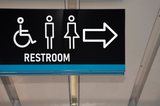
- Language Barriers: In multicultural environments, language diversity can pose challenges. Incorporating universally recognized symbols and multiple languages on signage can help bridge communication gaps.
- Maintenance and Updates: Over time, building layouts may change, requiring signage updates. Designing modular signage that can be easily replaced or modified can help keep information current without significant costs.
Successful Case Studies
Several organizations have successfully implemented wayfinding systems that enhance user experience:
- Hospitals: Many hospitals have adopted color-coded signage systems that use different hues to guide patients and visitors to specific departments. For example, a local hospital utilized a green theme for its outpatient services, helping users navigate the facility with ease.
- Universities: A prominent university revamped its wayfinding signage by incorporating large, easily readable maps at key intersections, along with digital kiosks for real-time information. This change significantly reduced the time students spent searching for classrooms.
Interior wayfinding signage plays a crucial role in enhancing navigation and improving user experience within a building. By focusing on visibility, readability, and design coherence, organizations can create effective signage systems that meet the needs of all users. Through thoughtful design and strategic placement, businesses can not only guide individuals efficiently but also strengthen their brand identity. As you consider implementing or updating wayfinding signage in your space, remember that effective communication is the key to a positive user experience. Explore your options, engage with professionals, and embark on a journey toward improved navigation!


